Amazon | 2019
Echo Loop
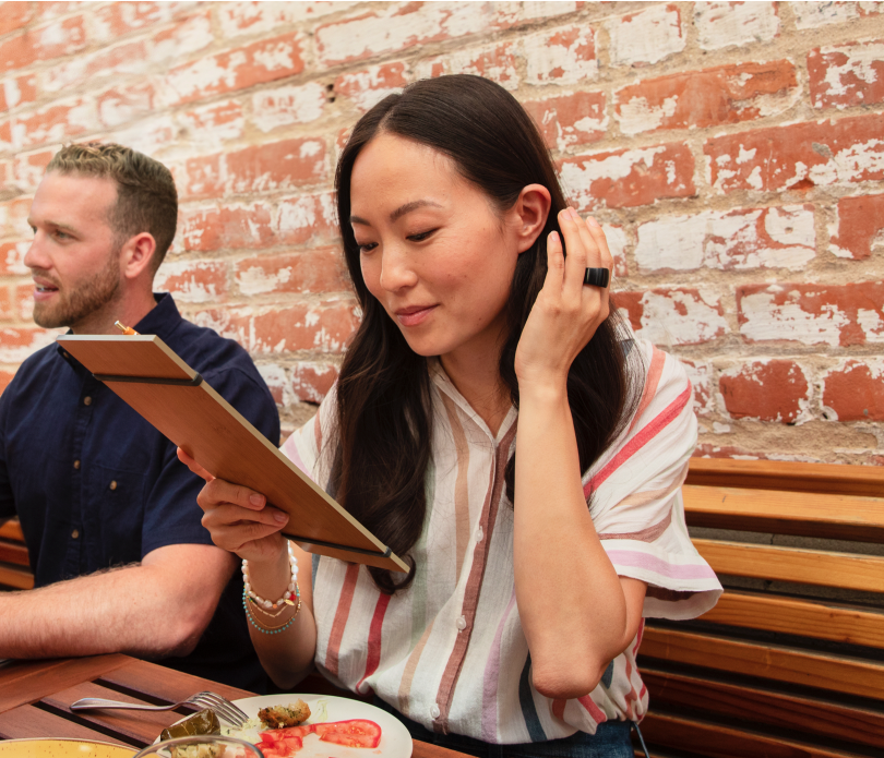
I was the lead designer of the beta version of the Echo Loop hardware UX, and it's associated experiences in the Amazon Alexa App. The UX I defined is largely in-tact in the Day 1 public launch version of the product.
The Challenge
Alexa is incredibly complex. A ring's form factor and relevant use cases are incredibly simple. I had to work with my business, engineering and industrial design counterparts to ensure we allowed Alexa's simplicity to shine on-the-go.

It's Alexa
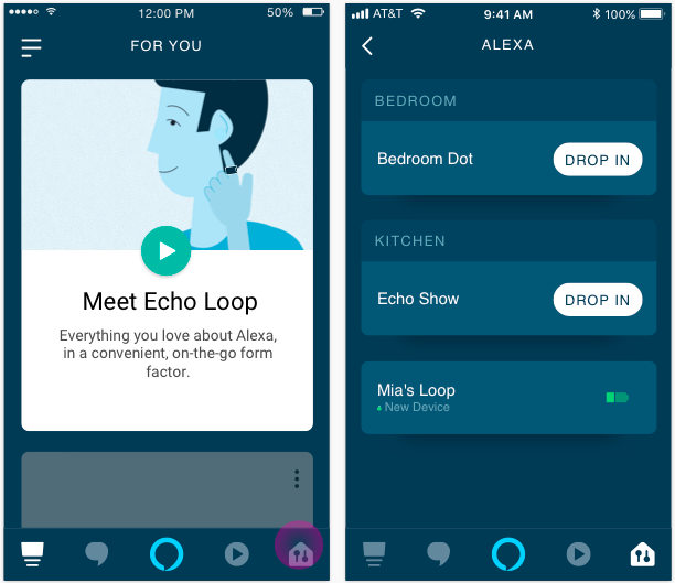
Like most (not all) Echo devices, the Echo Loop found it's home in the Alexa app. I designed end-to-end experiences of the Echo Loop across Alexa's surface; including set up, education, help and configuration experiences.
Ring UX
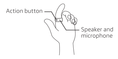
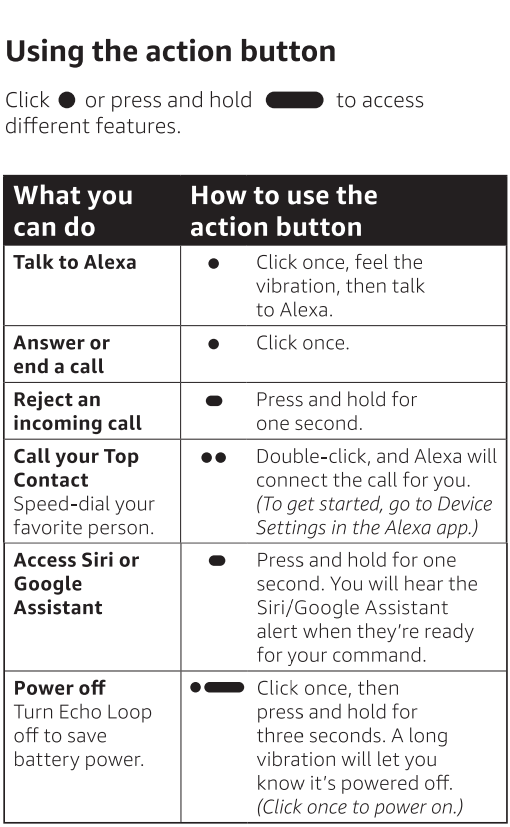
I worked with the Amazon Devices hardware design team to identify how we would leverage the Action button and Microphone as the products sole inputs. It was a unique design challenge, where the constraints needed to be embraced.
We eventually landed on a tap triggering Alexa, and a hold triggering your phone's native assistant- for predictability.
Solution
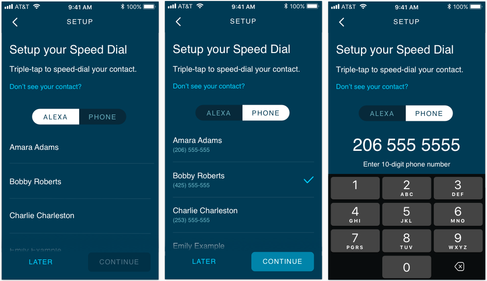
The single use case that stuck out to us the most was calling. It led us to bringing back the old concept of "speed dial". This feature is unique to the Echo Loop, and to drive adoption I designed it as a (skippable step) in product onboarding.
Set up via Alexa
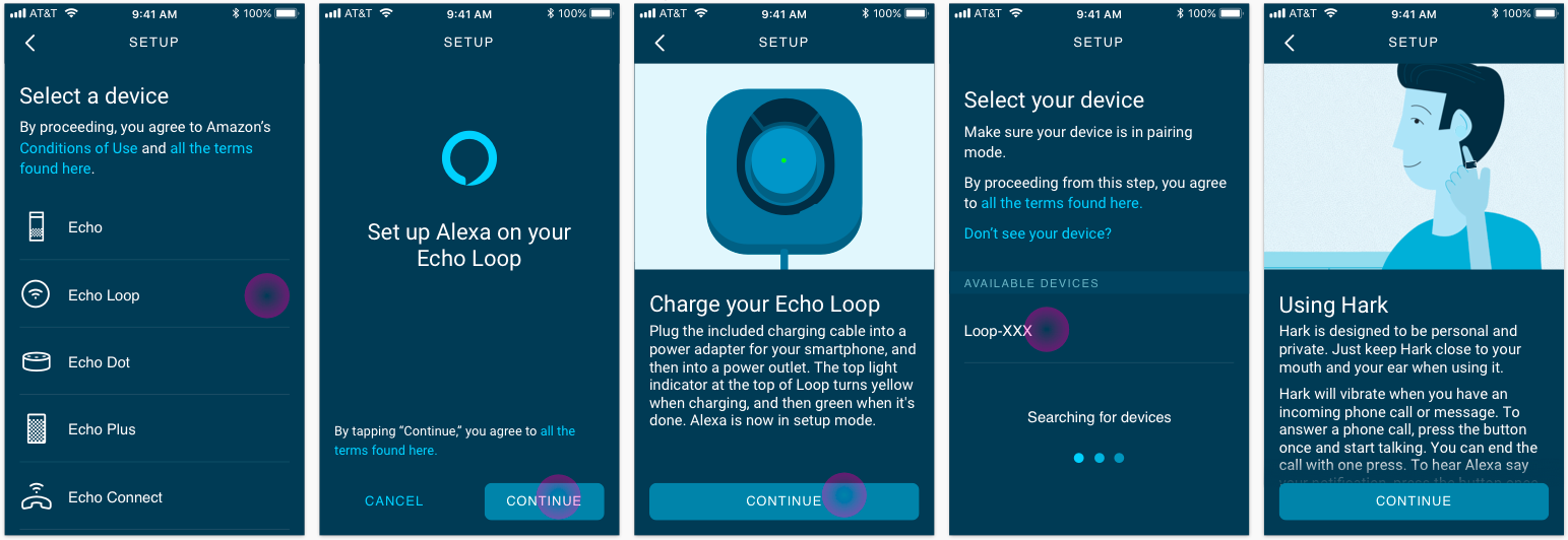
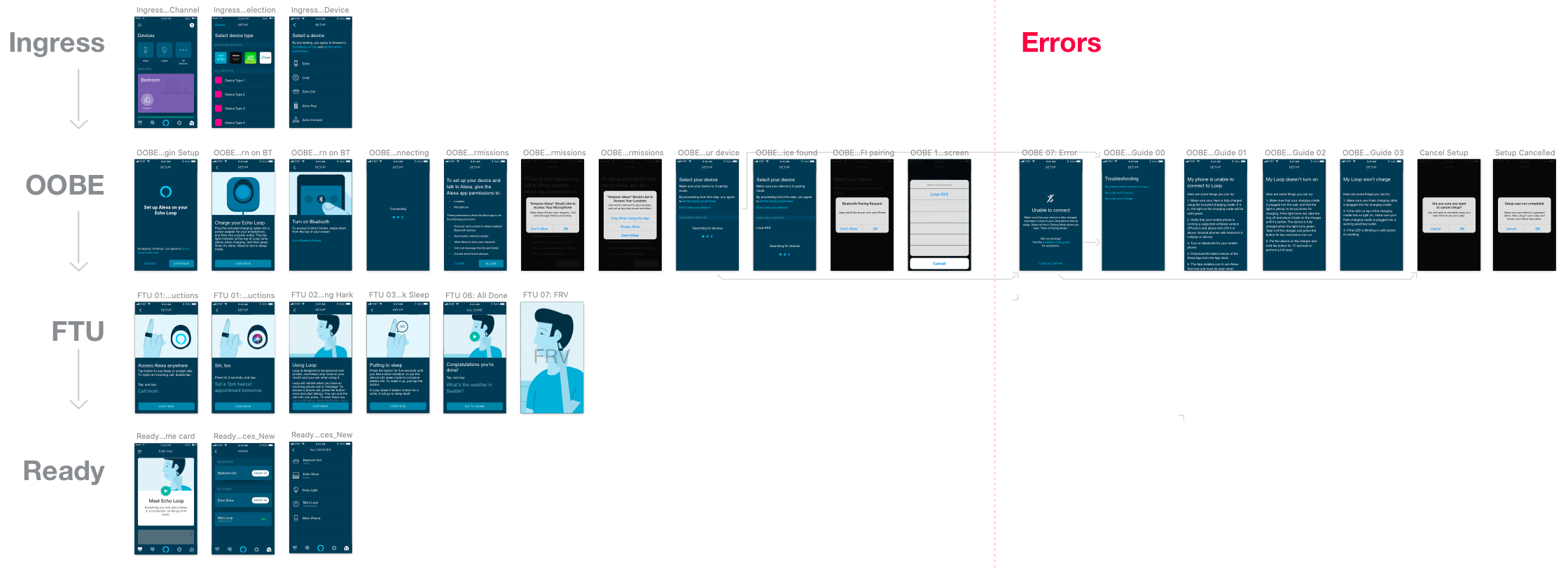
I led design of Echo Loop device set up, which takes place in the Alexa app. Workstreams included bluetooth pairing, device settings and error cases. Usability testing helped us identify friction points- allowing us to refine the UX incrementally in beta until it was launch ready.
The below screens reflect my final artwork placeholders that were used in beta. All artwork was ultimately replaced by the Alexa production design team once the product launched publicly.
