Microsoft + Kellogg's | 2012
Mom's Homeroom
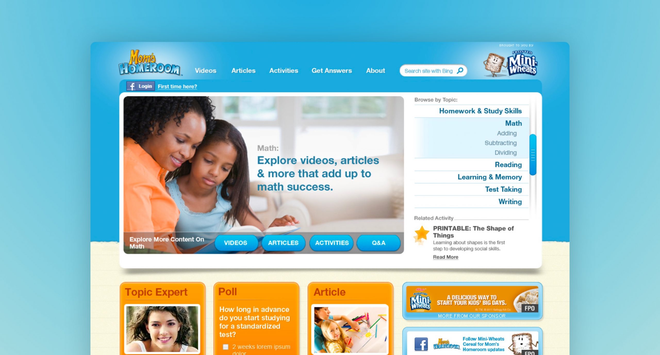
I redesigned this microsite brand destination, which served as a resource for moms. This microsite was so successful, it became Frosted Mini Wheats primary website for over a year, and won an Effie Silver Award!
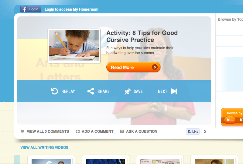
The website was designed to be an online resource packed with tips and tools to help you prepare your child for success in school. Content was designed for mothers, with use of video post-rolls encouraging parents to download activities for their children.
Built for content
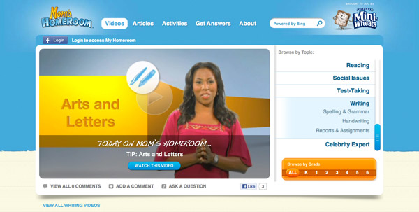
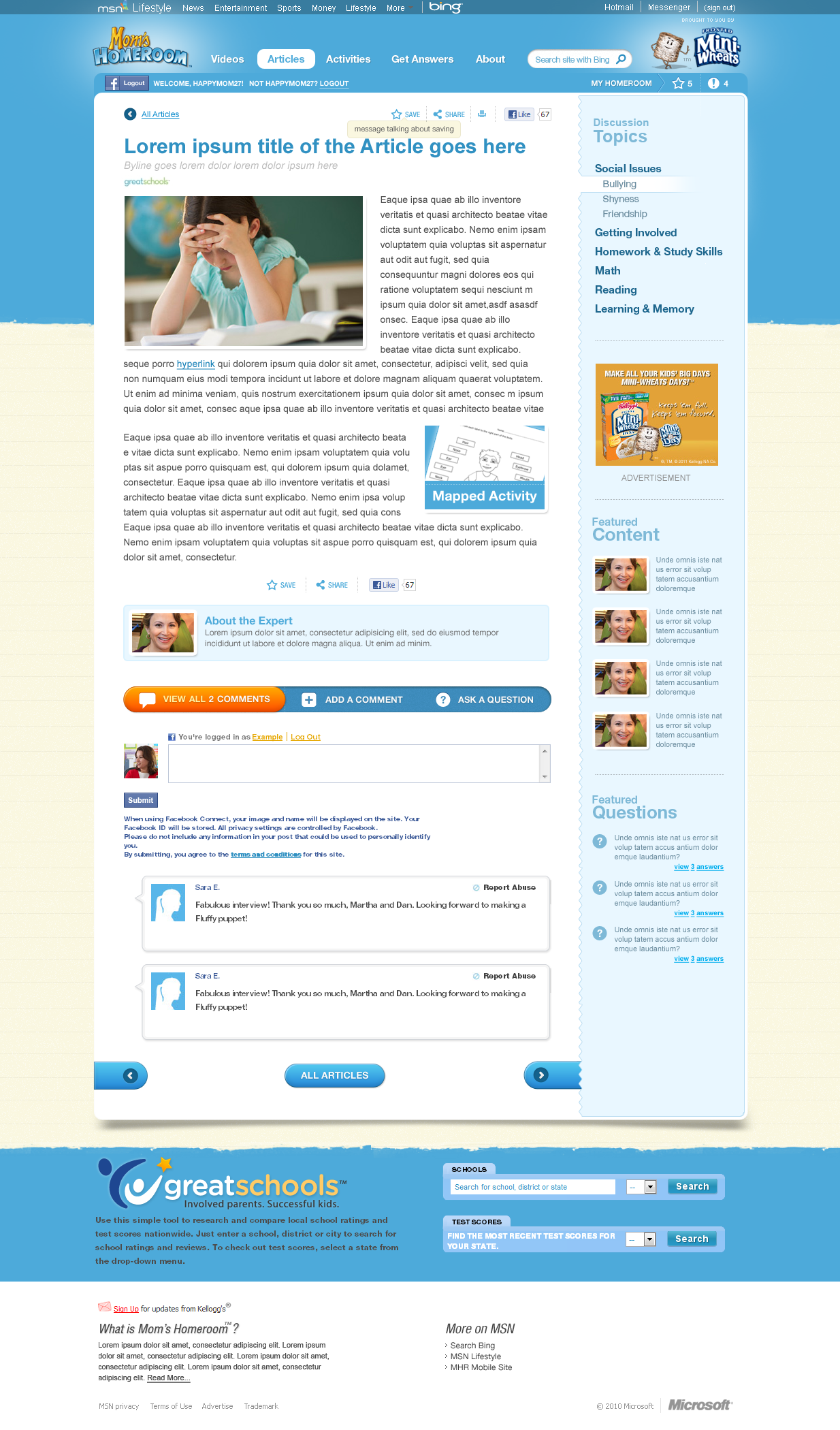
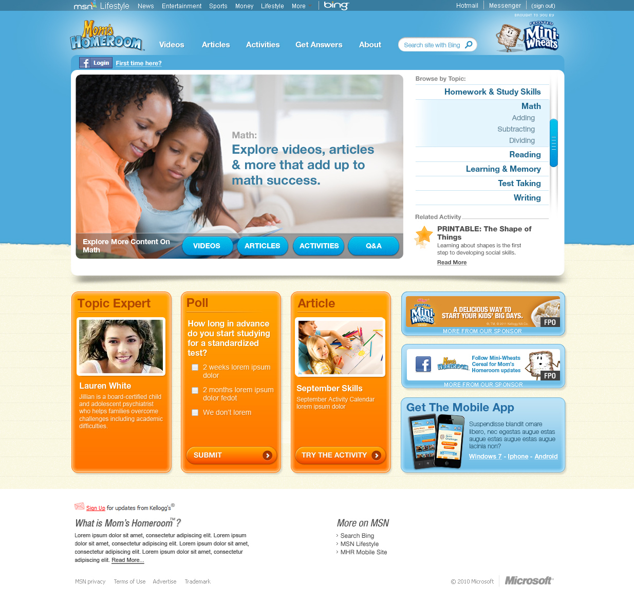
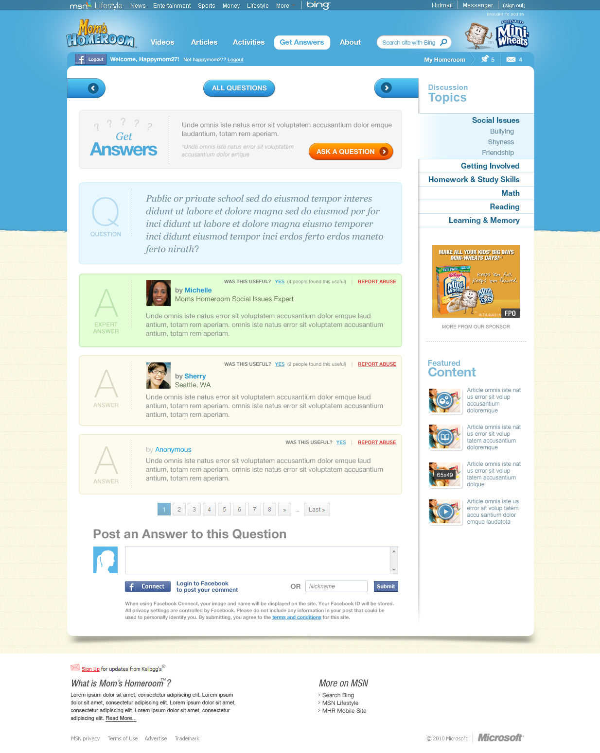
A content-filled, immersive experience for mom's, the website was designed to make it fast ane easy for mom's to find interesting and useful content.
UX Model
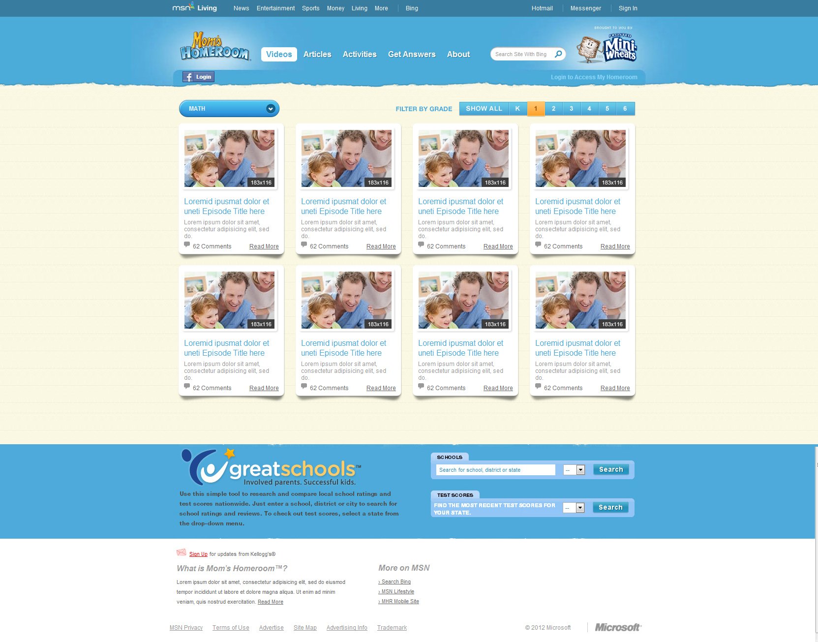
The UX model revolved around the content. It made video and written content the focal point, with everything else acting as a supporting actor.
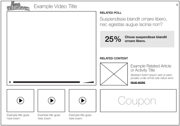
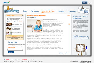
Before
The prior experience featured a fixed 3 column layout which compressed the content area, and generally lacked a focal point.
Key results
120%
2x
Engagement lift
More page-clicks
